10th Floor Please--Staging the Montage

Staging Stories~Reno, Nevada

This was a first...I'd never been to the Montage in downtown Reno before, so I was excited to see what a place in there looked like. It's funny how a change in environment can make you feel like you are worlds away even when you are in your own backyard. Walking into the lobby I felt like I was back in DC and living in the big city.

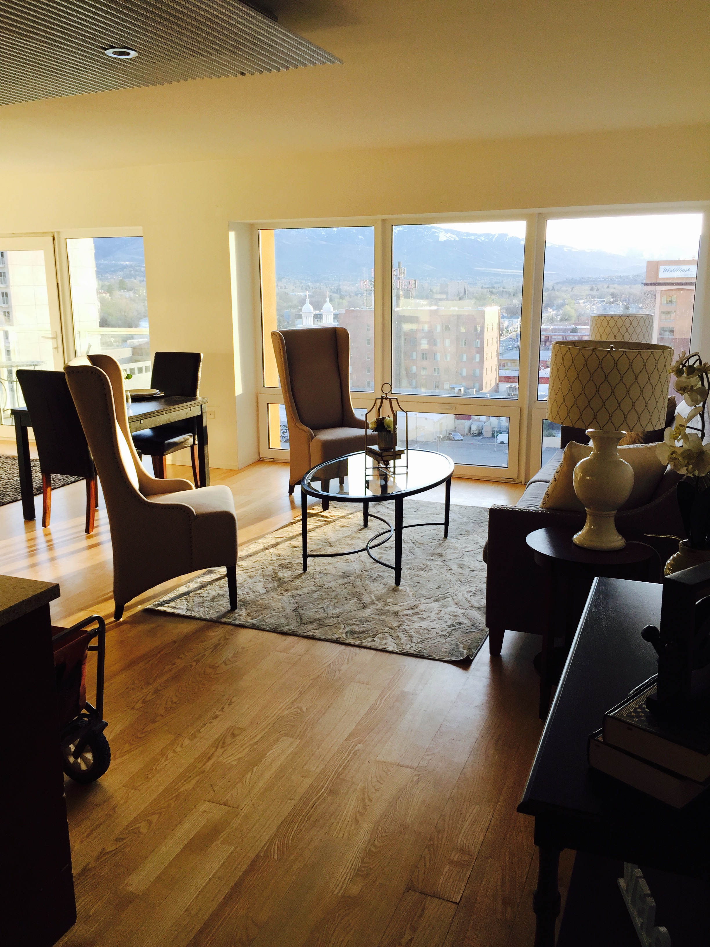
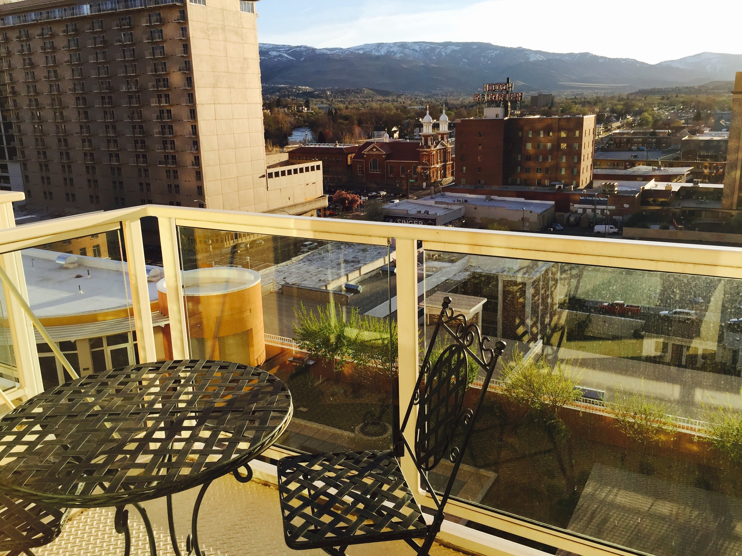
We took the elevator to the 10th floor and entered the studio. The space had a nice layout: living room, kitchen/dining, bedroom, bathroom and outdoor balcony. Just enough room for all of the essentials. The best feature though, was the view! HOLY WOW! I could sit there all day and watch the beautiful show mother nature provides. 

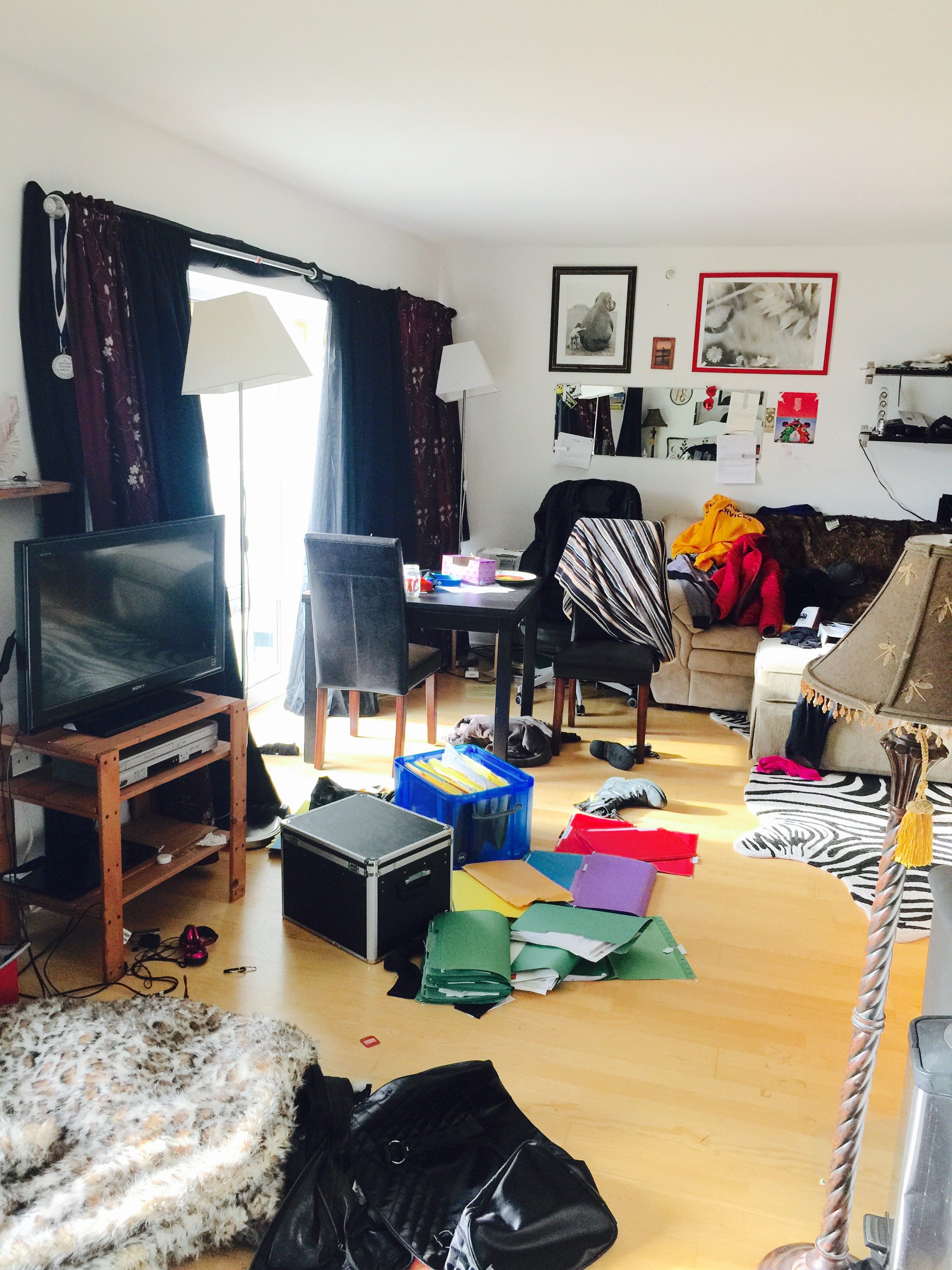
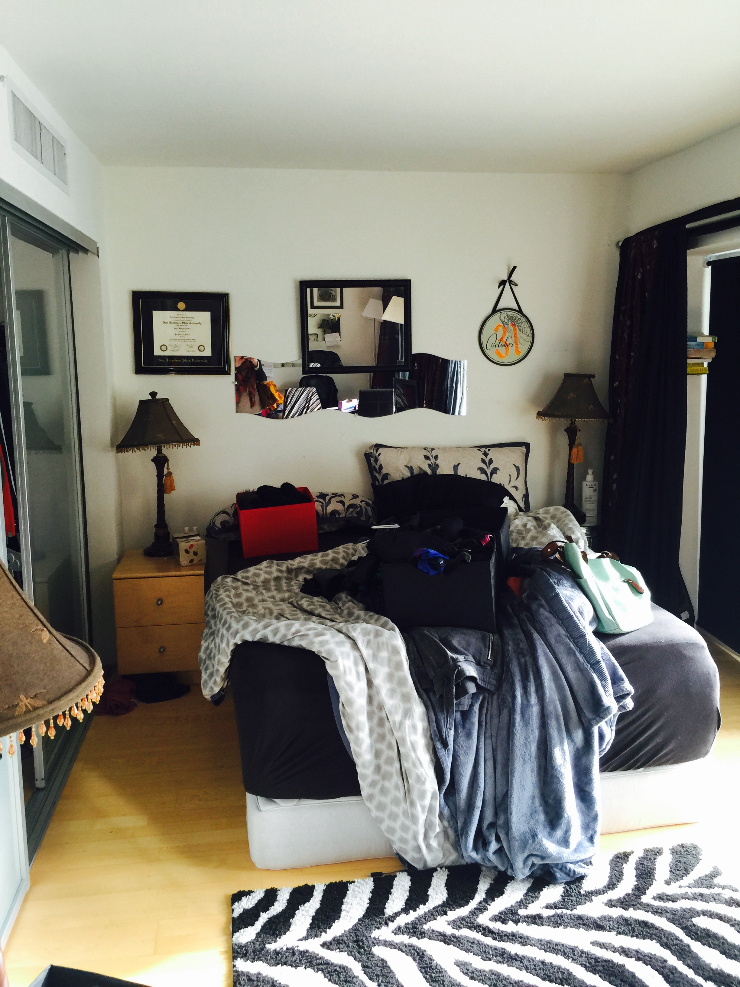
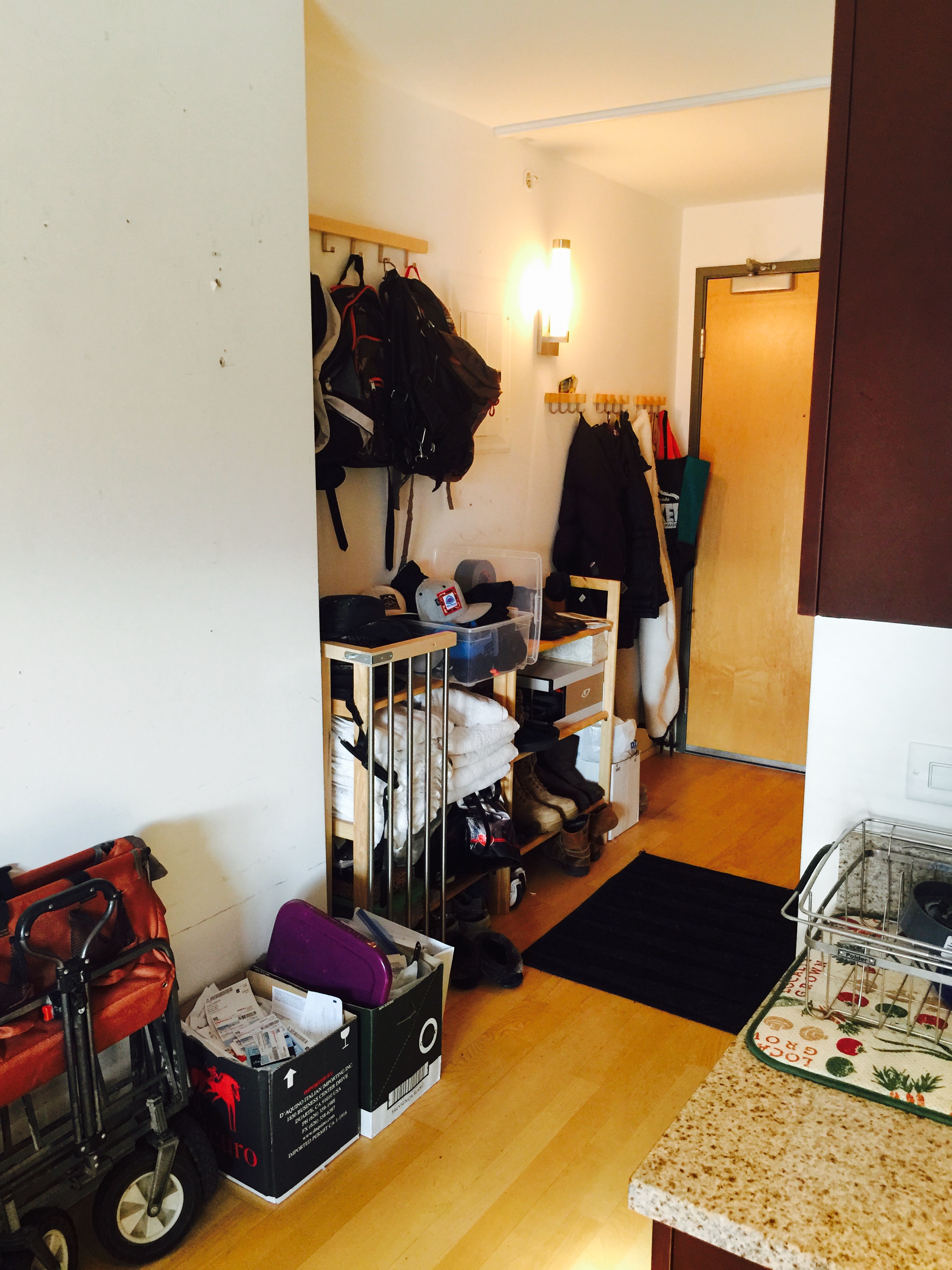
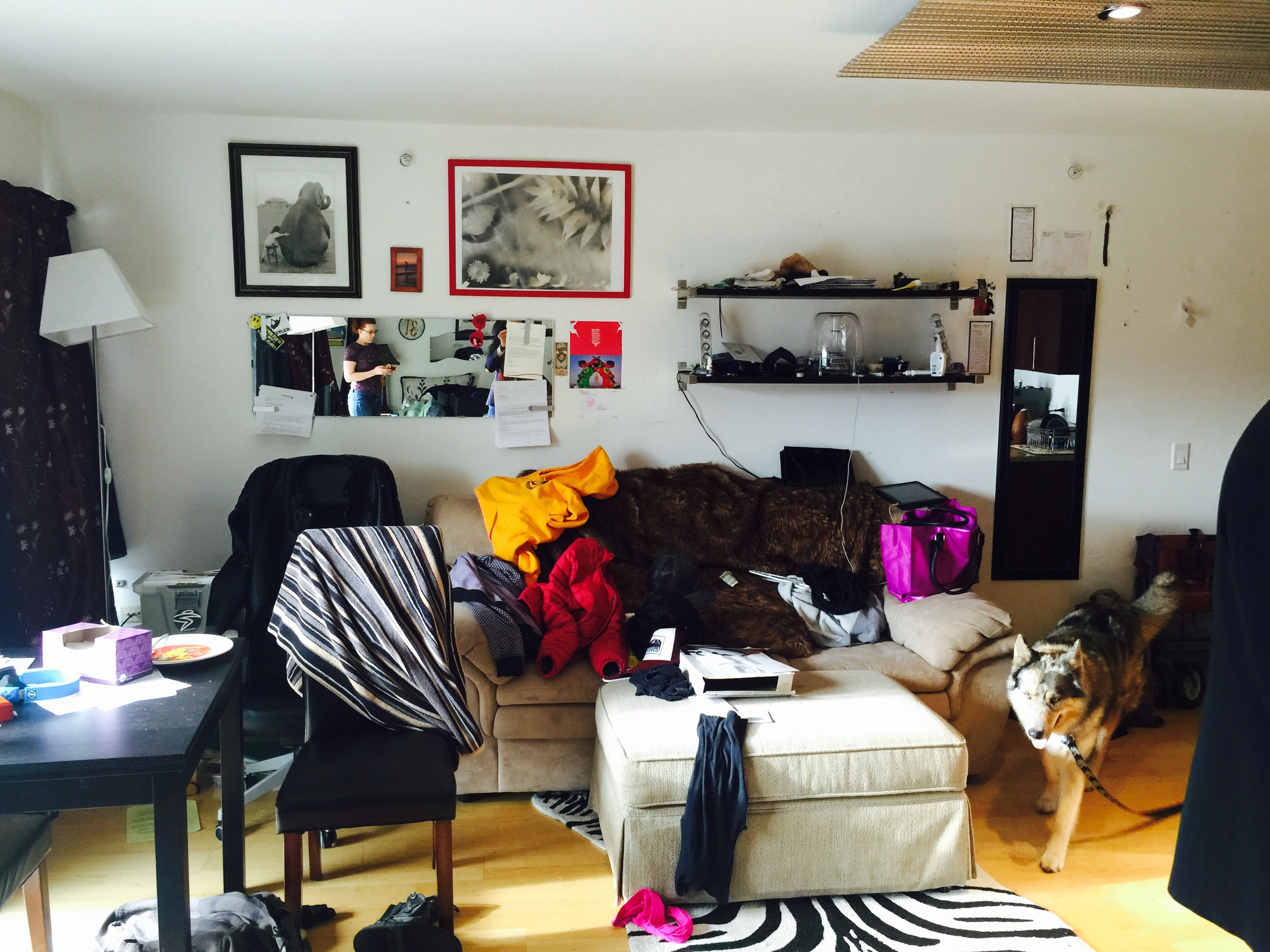
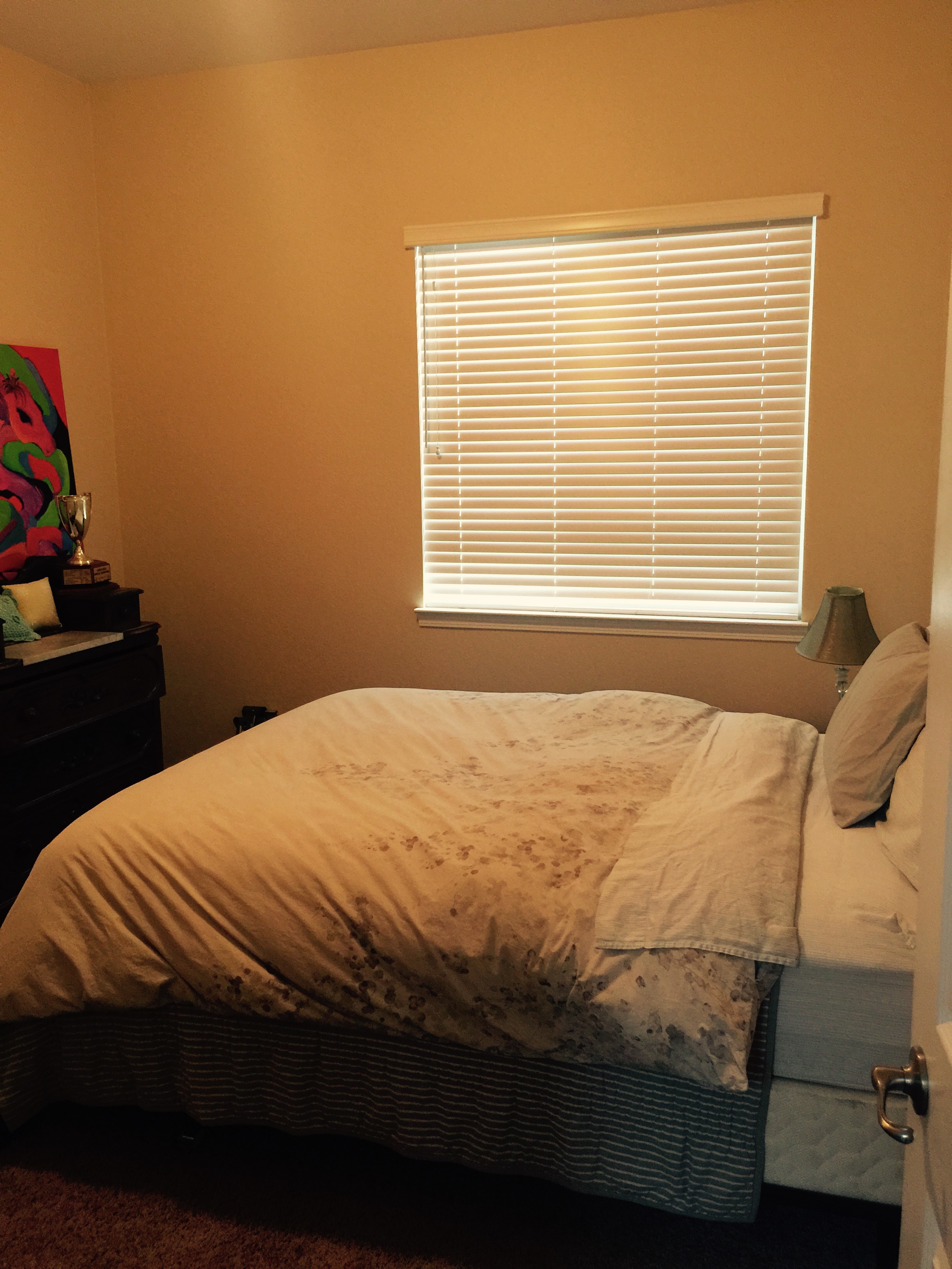
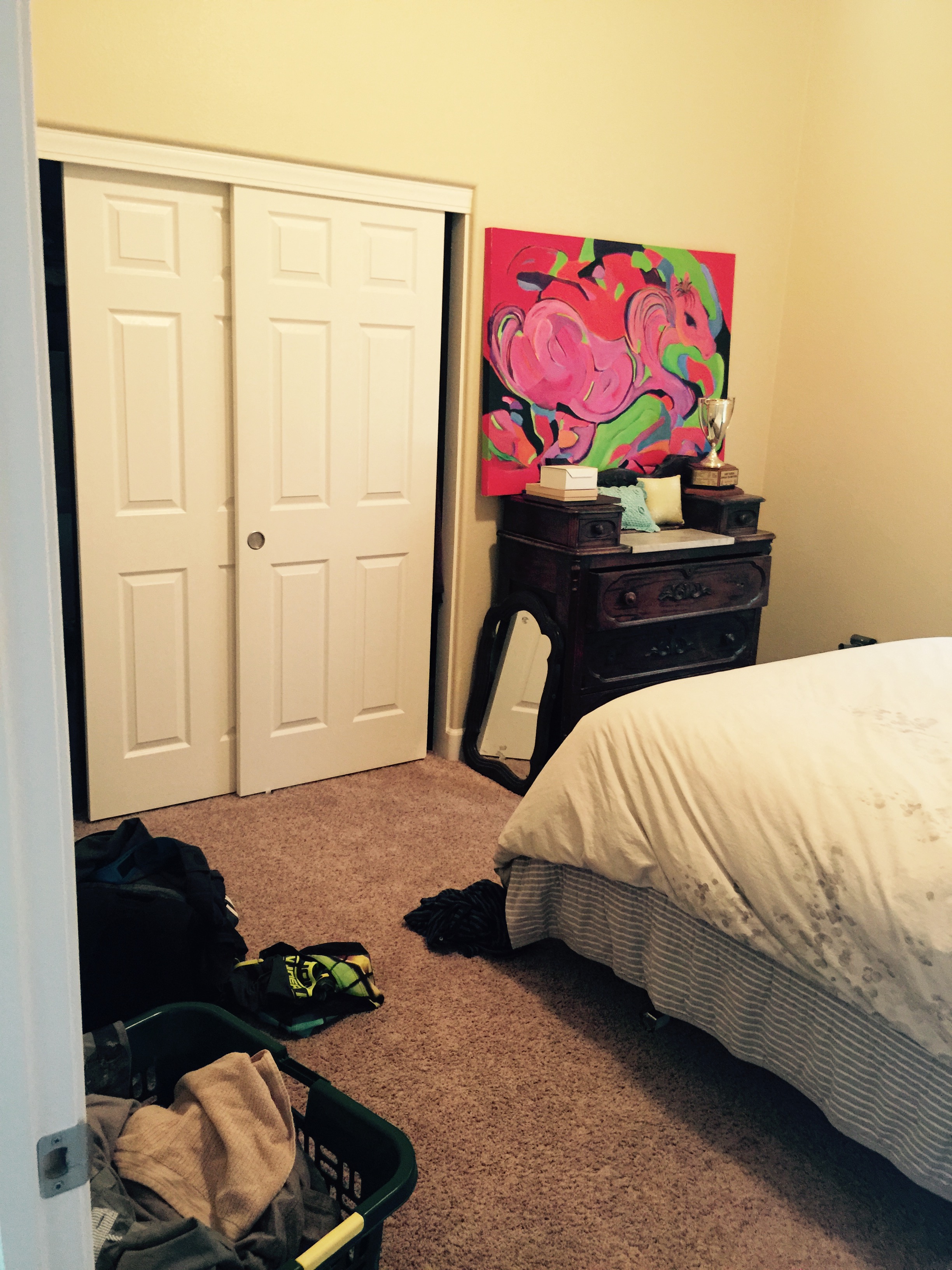
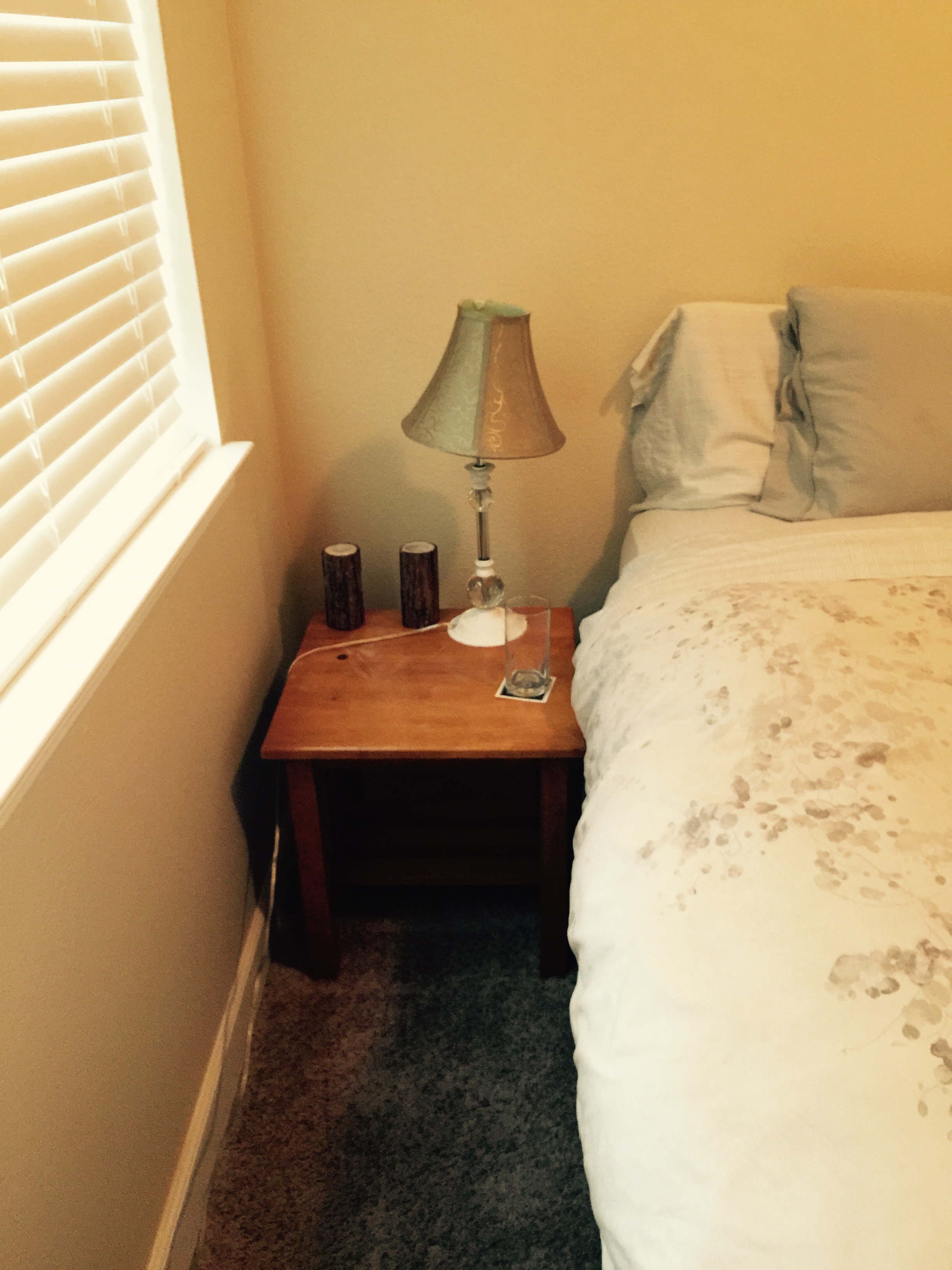
Each time I stage, I like to take before photos so you can see the transformation unfold. Scroll down to see all of the before images.

I made my notes and began to formulate the plan for this space. The renter that was currently living there was moving out the following week so that meant we would have a blank canvas to work with when we returned. 

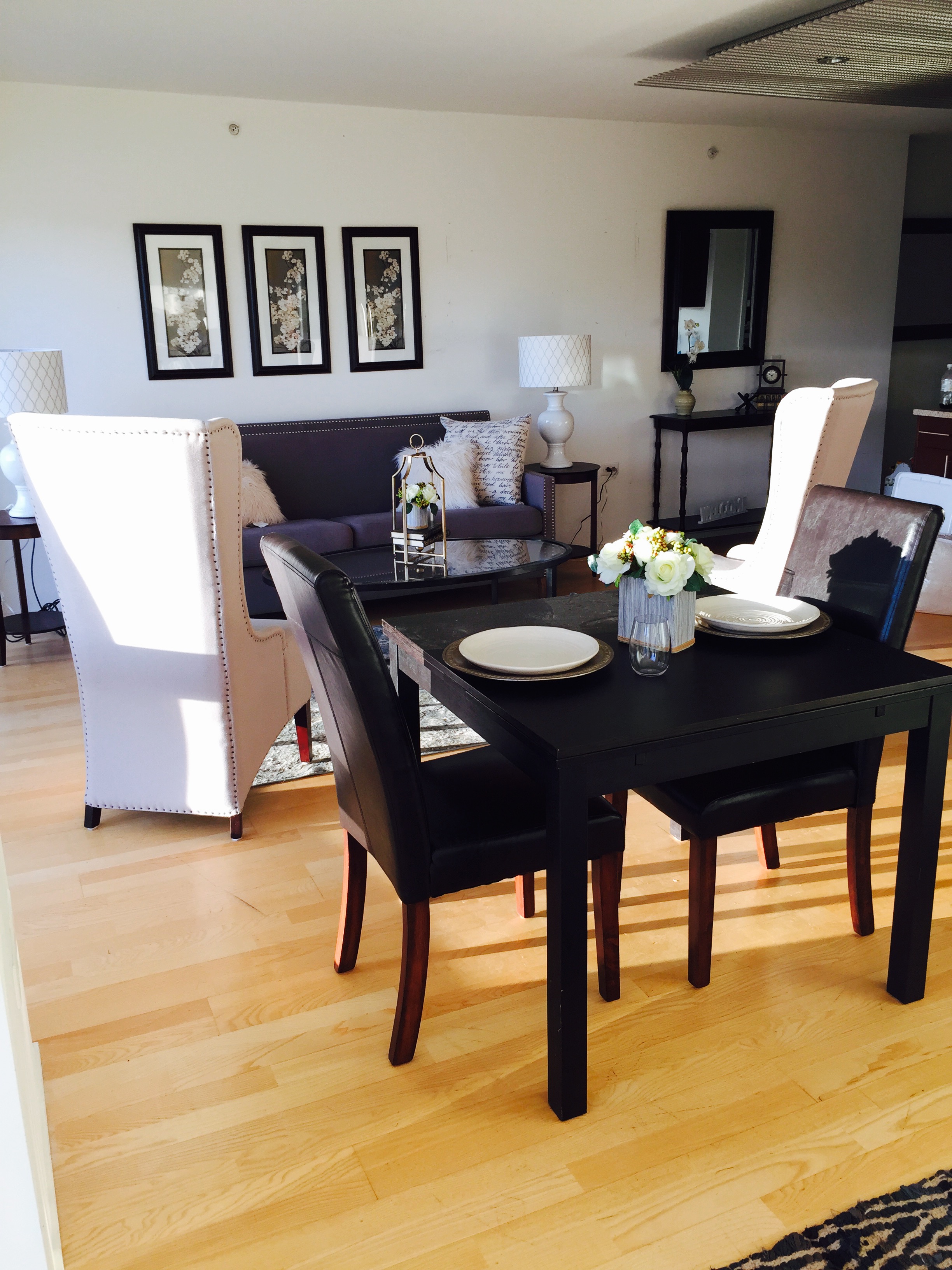
To me this space felt chic, fresh and modern. I wanted to encompass the glitter of the city lights within the walls so I chose to incorporate metallic accents to bring that city glimmer inside. Additionally, the view had to be highlighted so all of the curtains were removed, allowing the natural light to come pouring in. 

The living room provides a cozy conversation area with panoramic views of the cityscape and the Truckee River. 

We used the dining table to create a separation between the living area and the bedroom. Dinner for two anyone? 
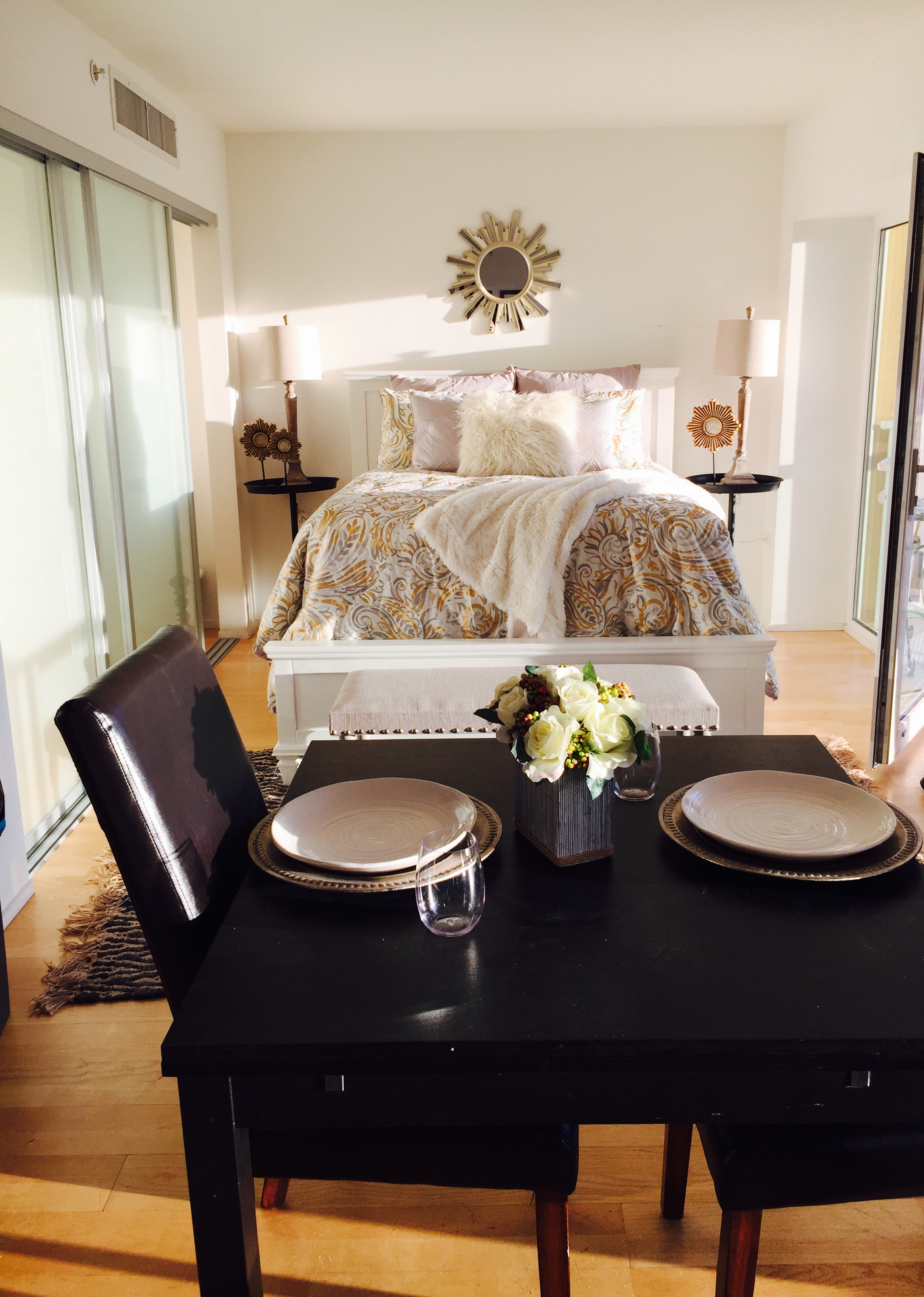
Sweet dreams are made of this! Don't you just want to hop into bed? 

If this were my place? I'd have coffee on the balcony every morning!

Would you like to see this property in person? Contact Chris Smith with Keller Williams today because this little slice of heaven isn't going to last long. 

Polishing Up Diamond Ridge

There is a big difference between living in a home and living in a listed home. Even though a house is beautiful, when you are preparing to sell, sometimes it can require a little polishing. 
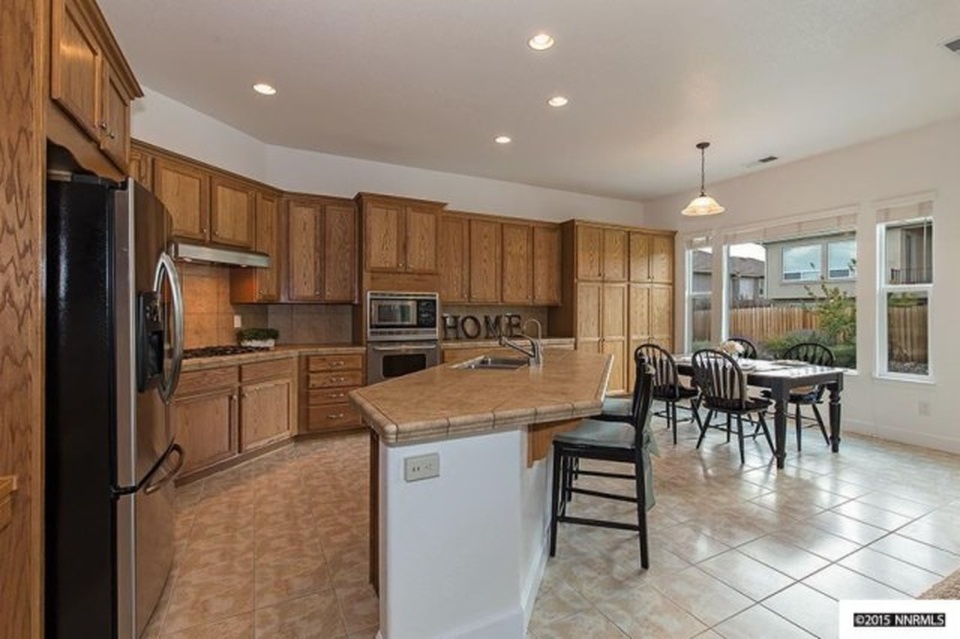
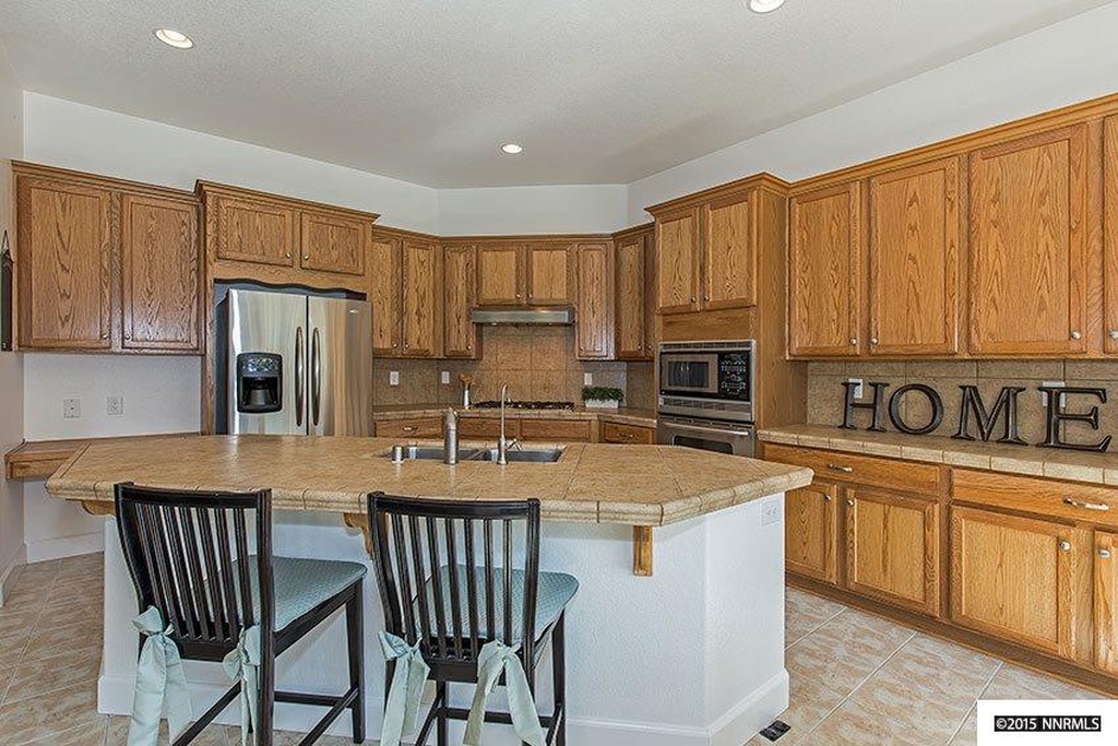
The house on Diamond Ridge is easy to love. A grand entry welcomes you and invites you into an open-concept floor plan that you can easily see yourself entertaining in. Both formal and informal dining allow you to set the tone for your dinner party. The kitchen has an unlimited amount of storage making it the perfect place for culinary creations.  The floorplan of the house gives a great deal of privacy to the master suite given that the additional two bedrooms are located on the opposite end of the house. The master bedroom and bath leave little to be desired, making it quite possibly my favorite room in the house! Two vanities are separated by a beautiful bathtub fit for the best bubble bath ever!

With this description, you are likely asking yourself, why was I called into stage this home? Sometimes an outside perspective can really help focus on your goals when selling the house. I offer various staging packages. In this case, I provided the couple with a homework list to complete before I arrived. Let me tell you, they aced the test! They checked off each item on the list I provided making it easy for me to come in and complete all of the finishing touches. 

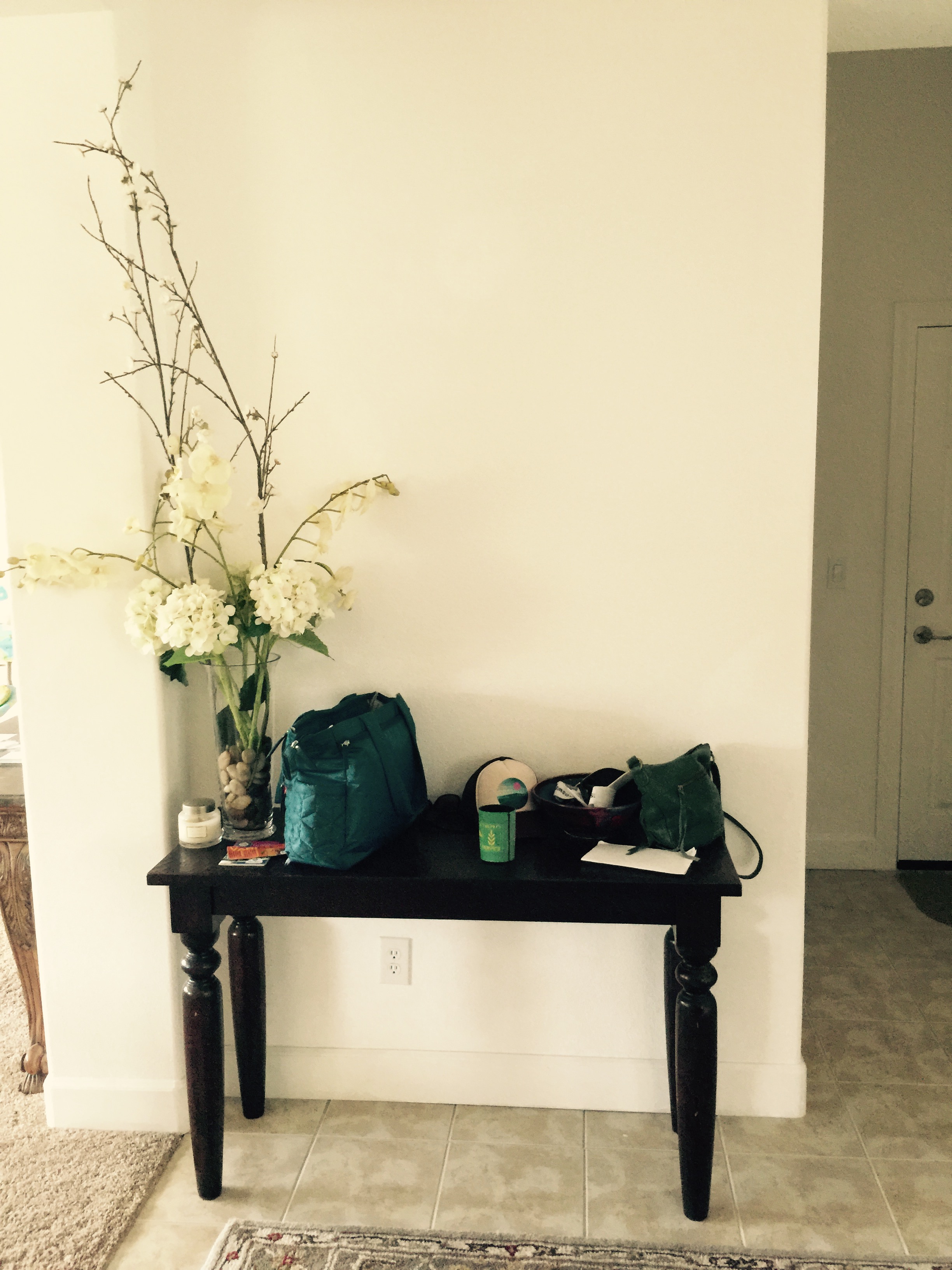
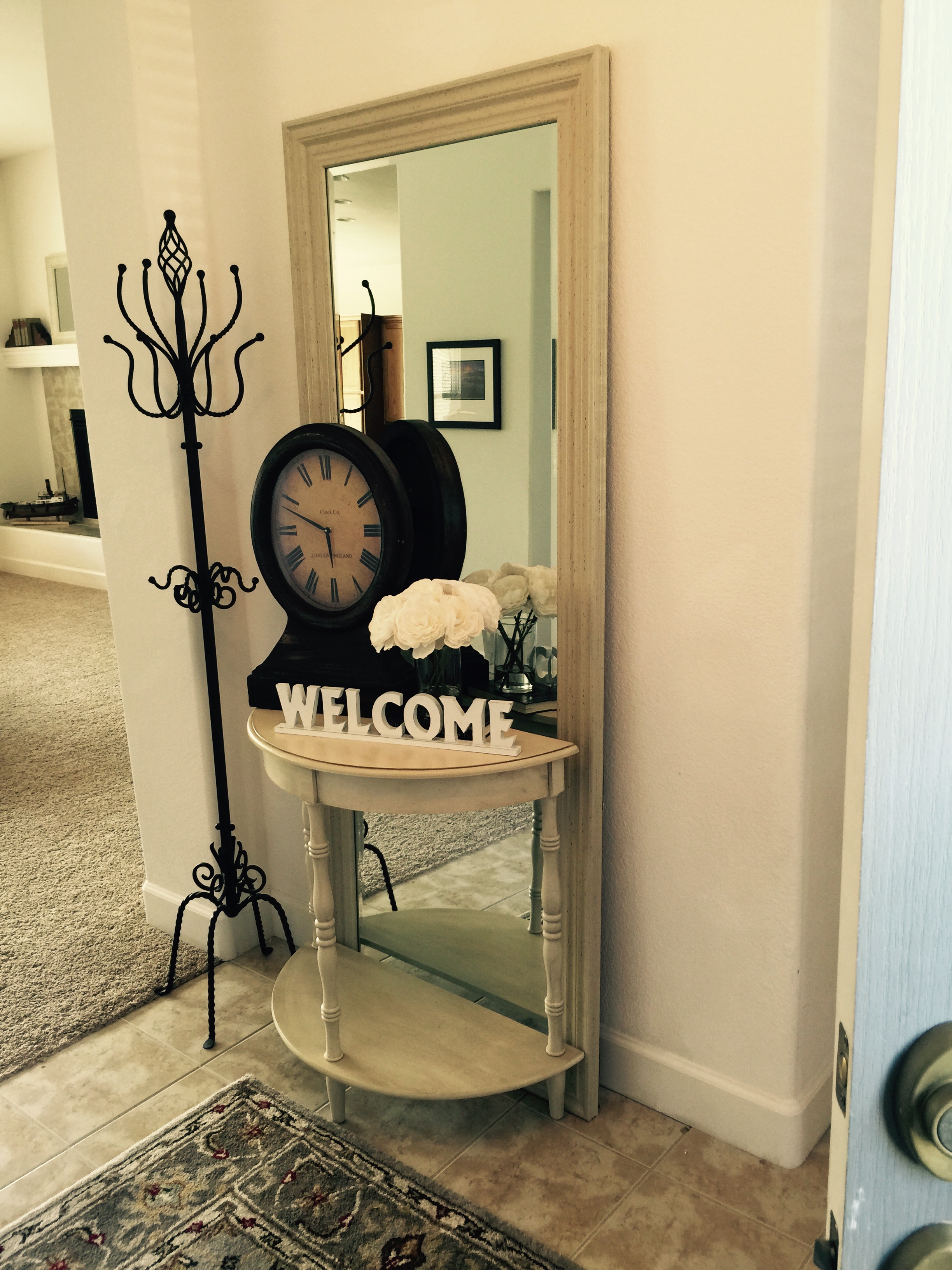
Pictured below is the entry way before and after staging. The first picture shows a great table that became a catchall, which is pretty typical for things close to the front door.
We kept things bright and cheery in the entry by adding a white floor length mirror, a smaller rounded-front table, a coat rack and some decorative accessories to welcome guests upon entering the house.  

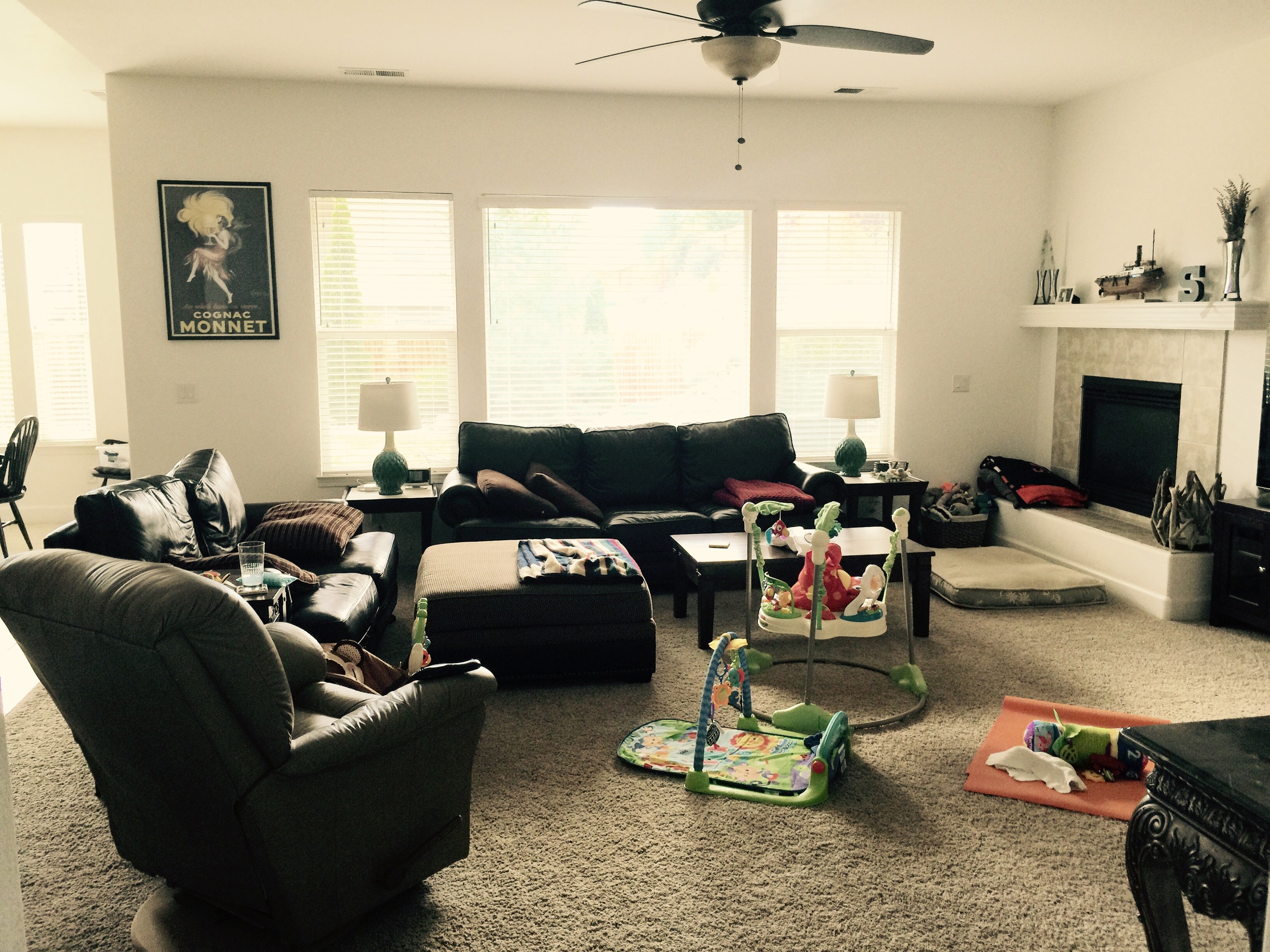
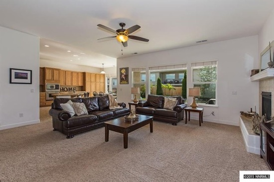
From there, we worked our way into the living room. The couch was set against the window, the love seat created a barrier between the kitchen and dining room and a recliner sat next to the love seat. A coffee table, an ottoman, several baby toys and a dog bed filled up the floor.

We simplified the decor in the space, removed the recliner and the ottoman. Also, we switched the positioning of the couch and the love seat and brought it out into the room a little more. Above the fireplace, we added a mirror and simplified the decorative accessories; added new decorative pillows to the couch and a cozy throw blanket. We moved the existing table lamps to the master and brought in a new set that tied in the warm wood tones from the kitchen and formal dining. There was a large ornately carved console table (not pictured) that was also removed. 

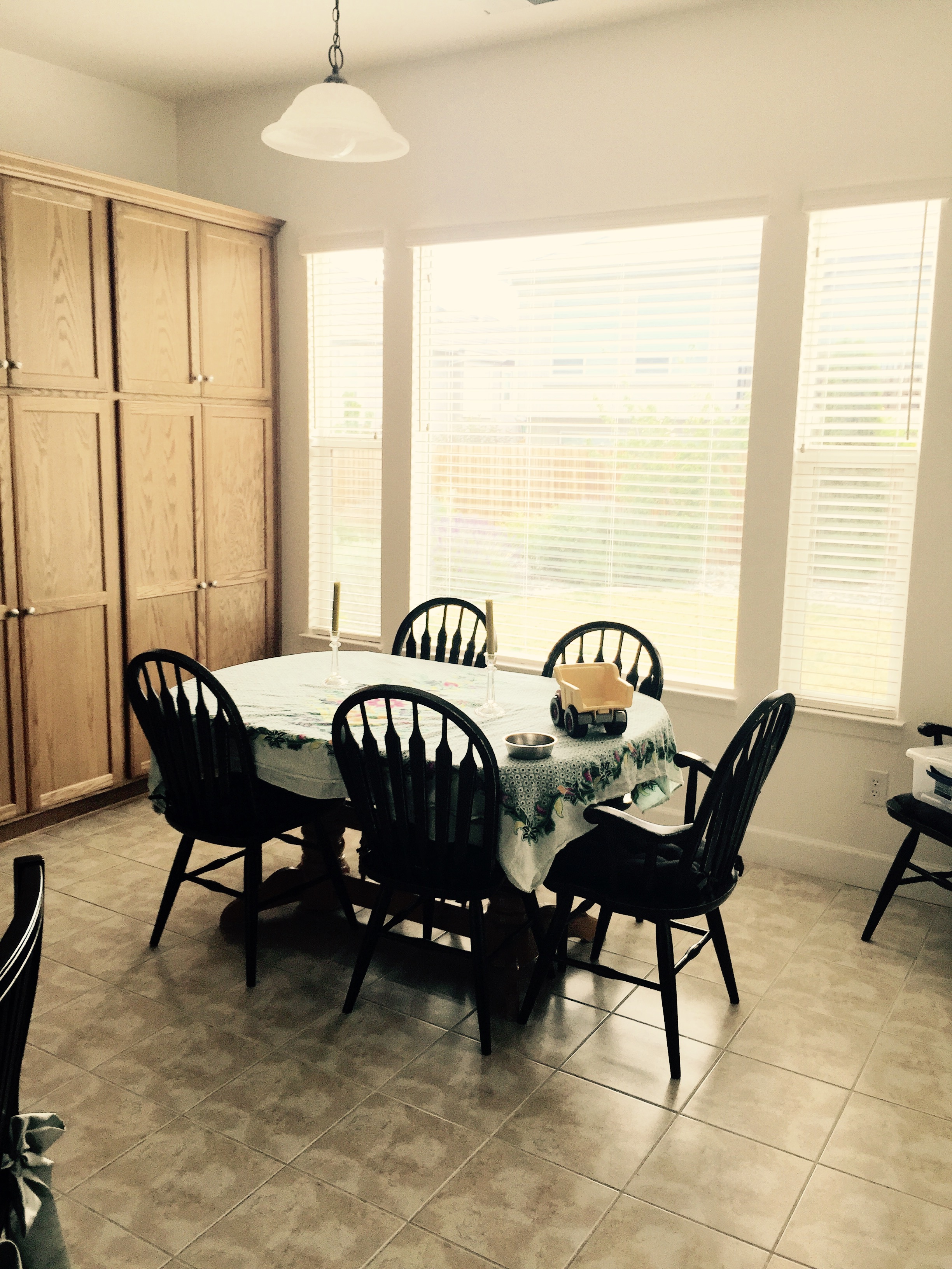
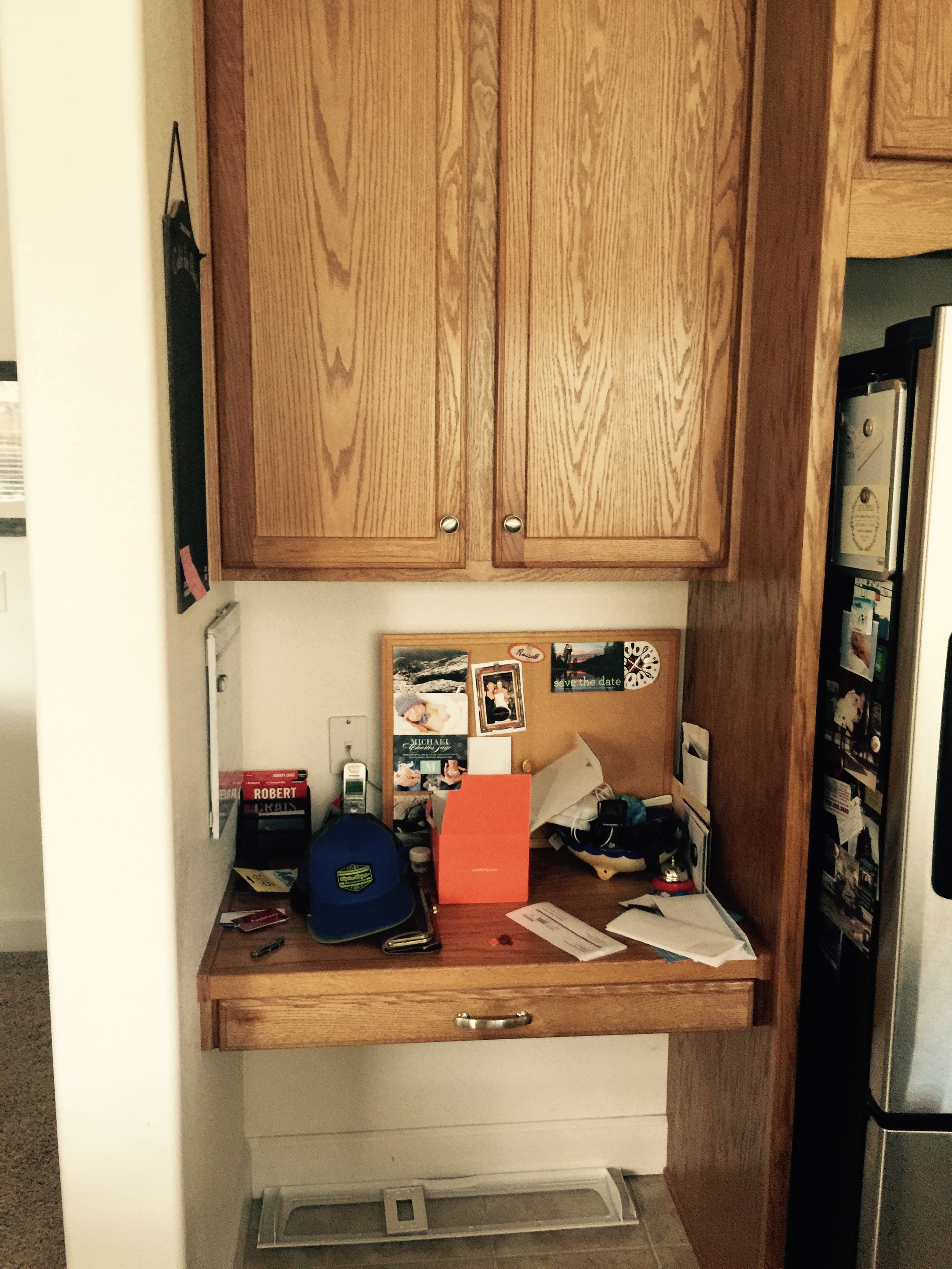
Moving onto the kitchen and casual dining, we asked the clients to remove everything from countertops. We removed the existing oak dining table and brought in a farm style table with a black base that matched the client's existing chairs. Instead of keeping all 6 chairs, we removed the two arm chairs and kept the 4 side chairs making it feel a little more spacious. 

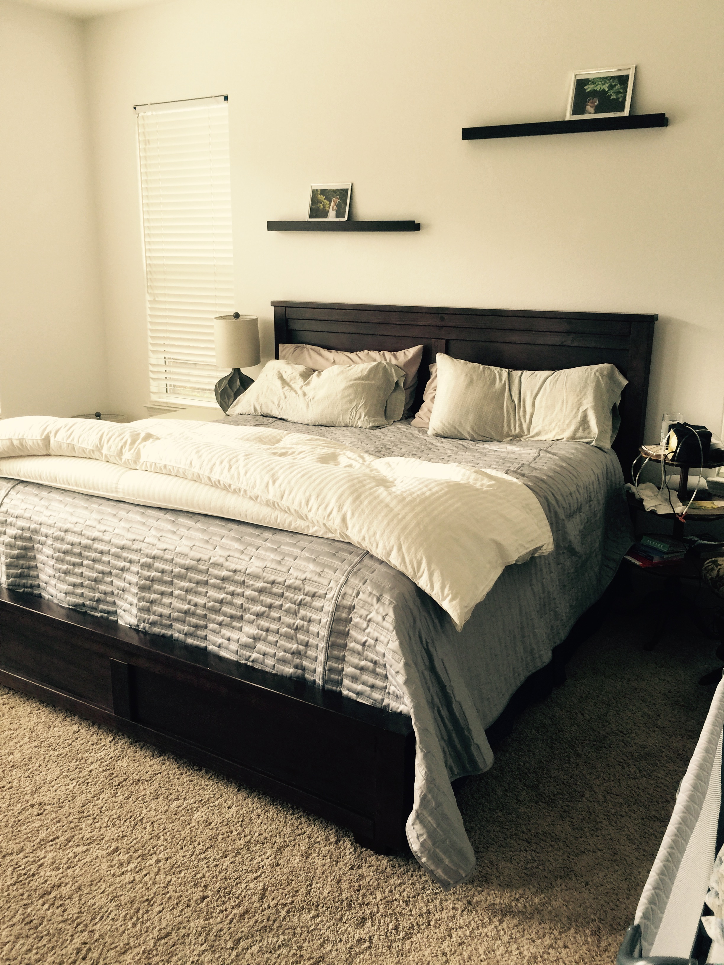
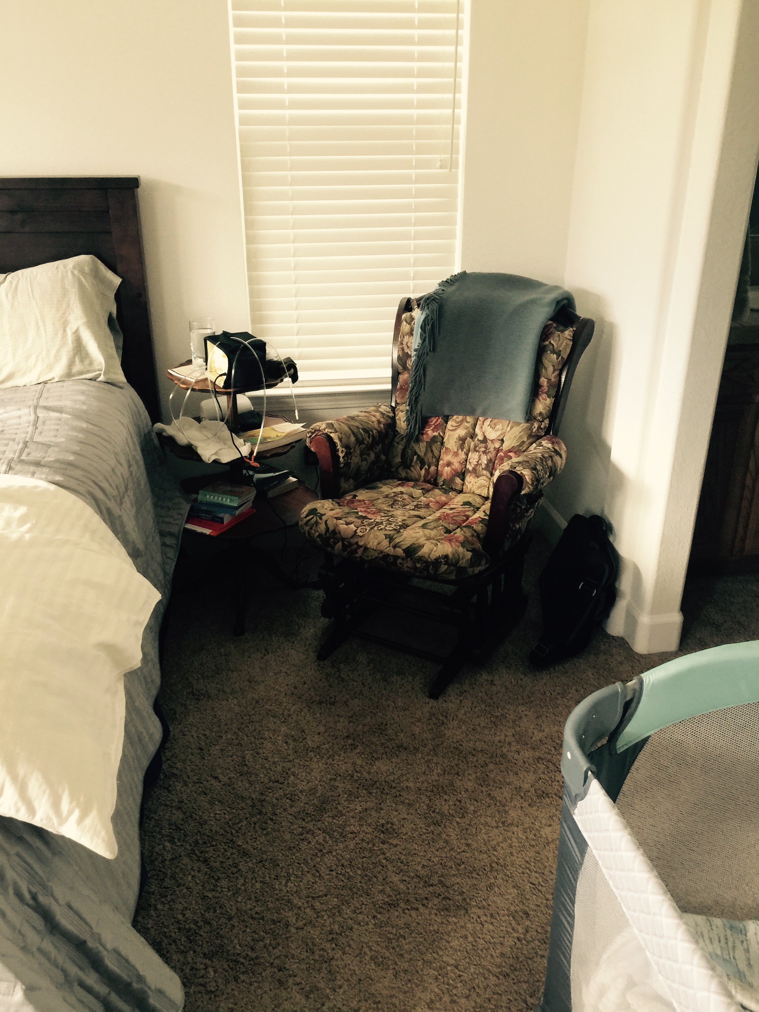
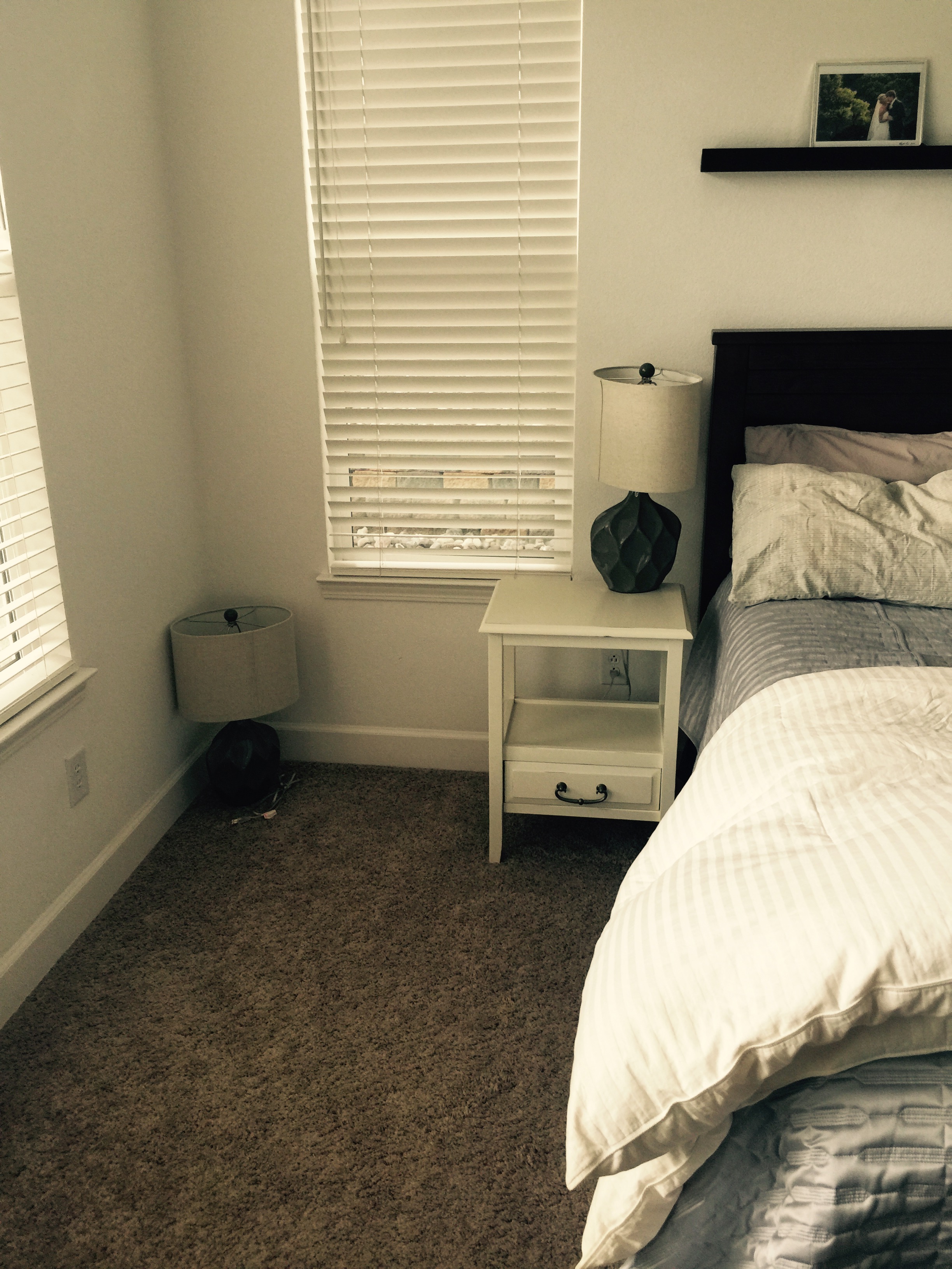
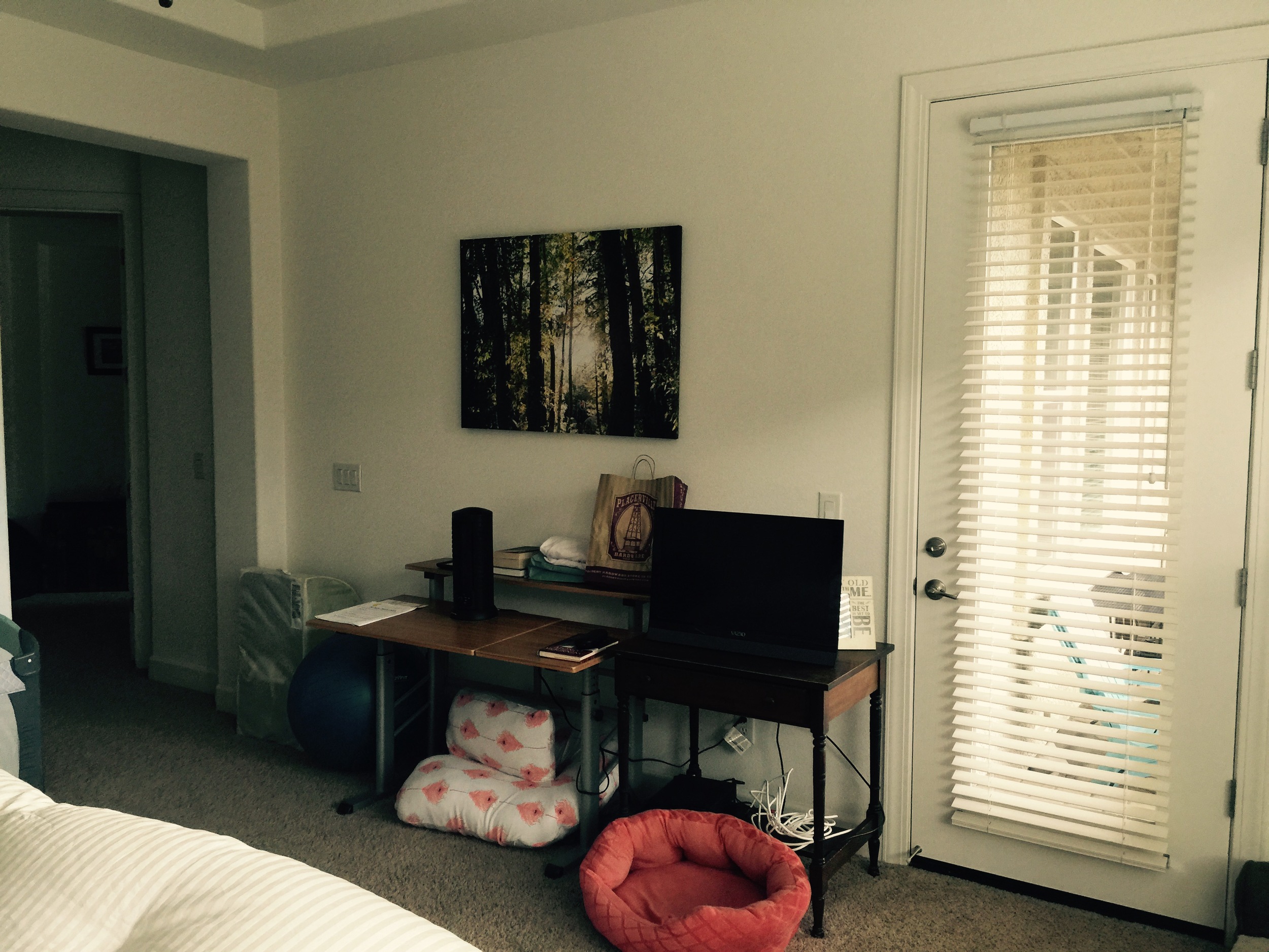
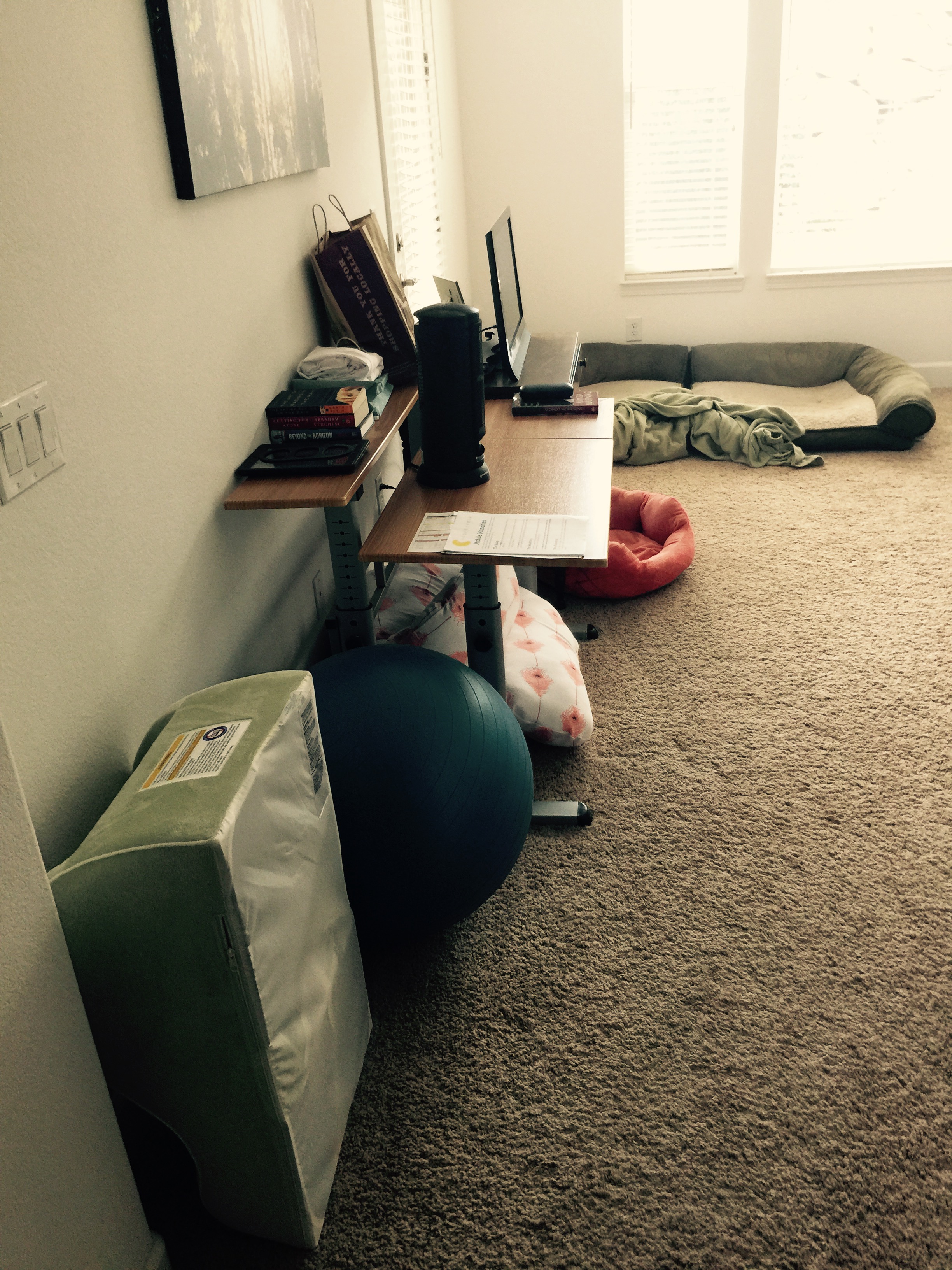
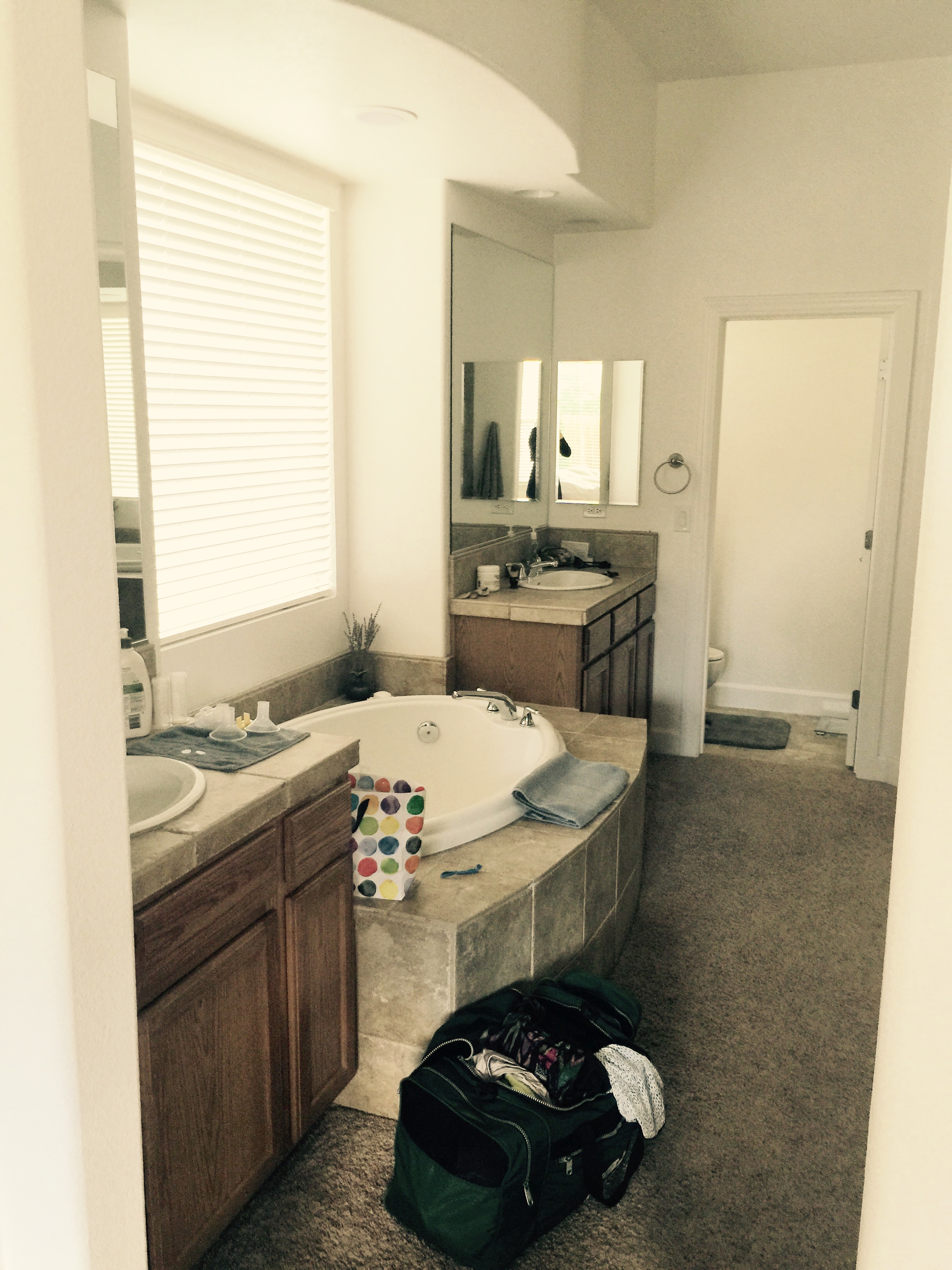
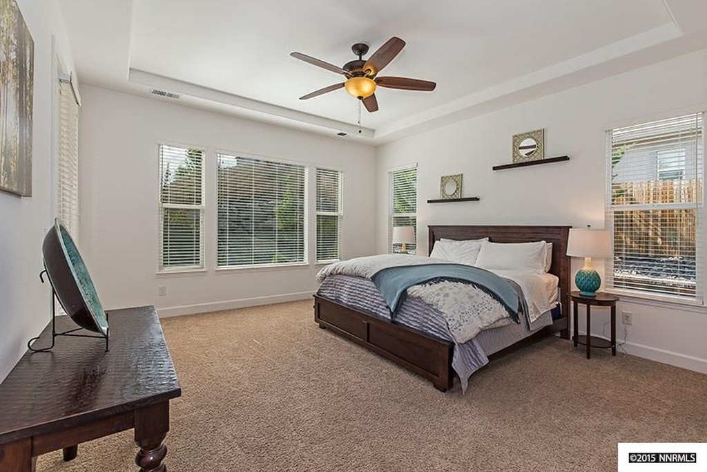
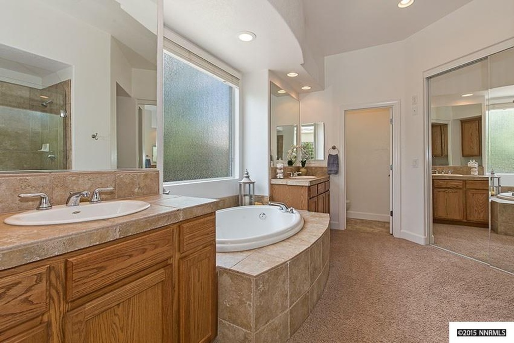
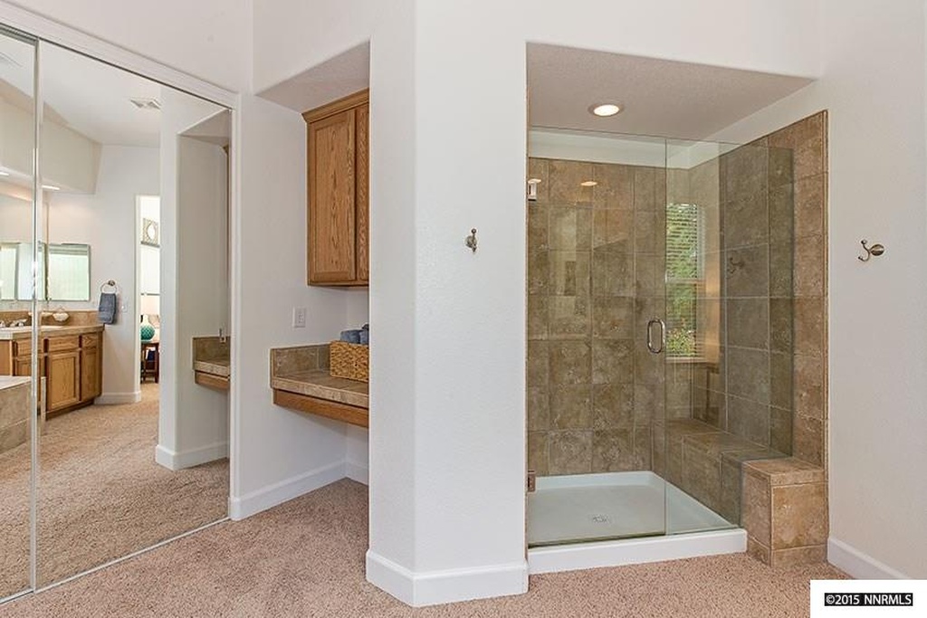
The Master Suite: This is a room that I could spend some time in. Spacious, great natural light and a master bath the size of a spa. I'll let the before and after photos do the talking on this one:

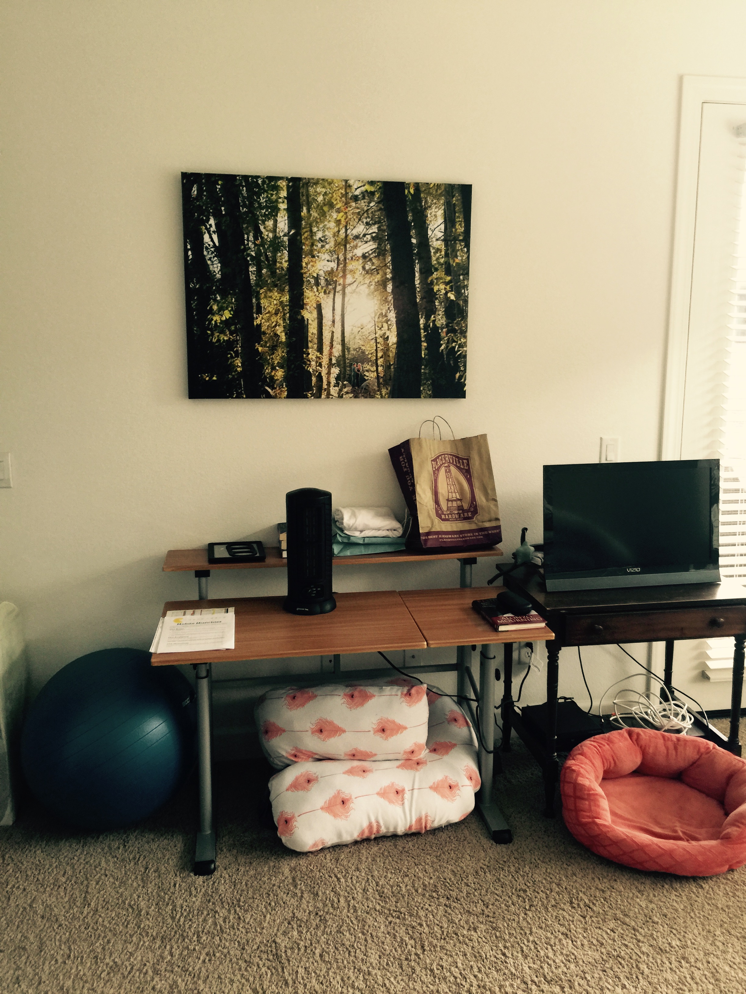
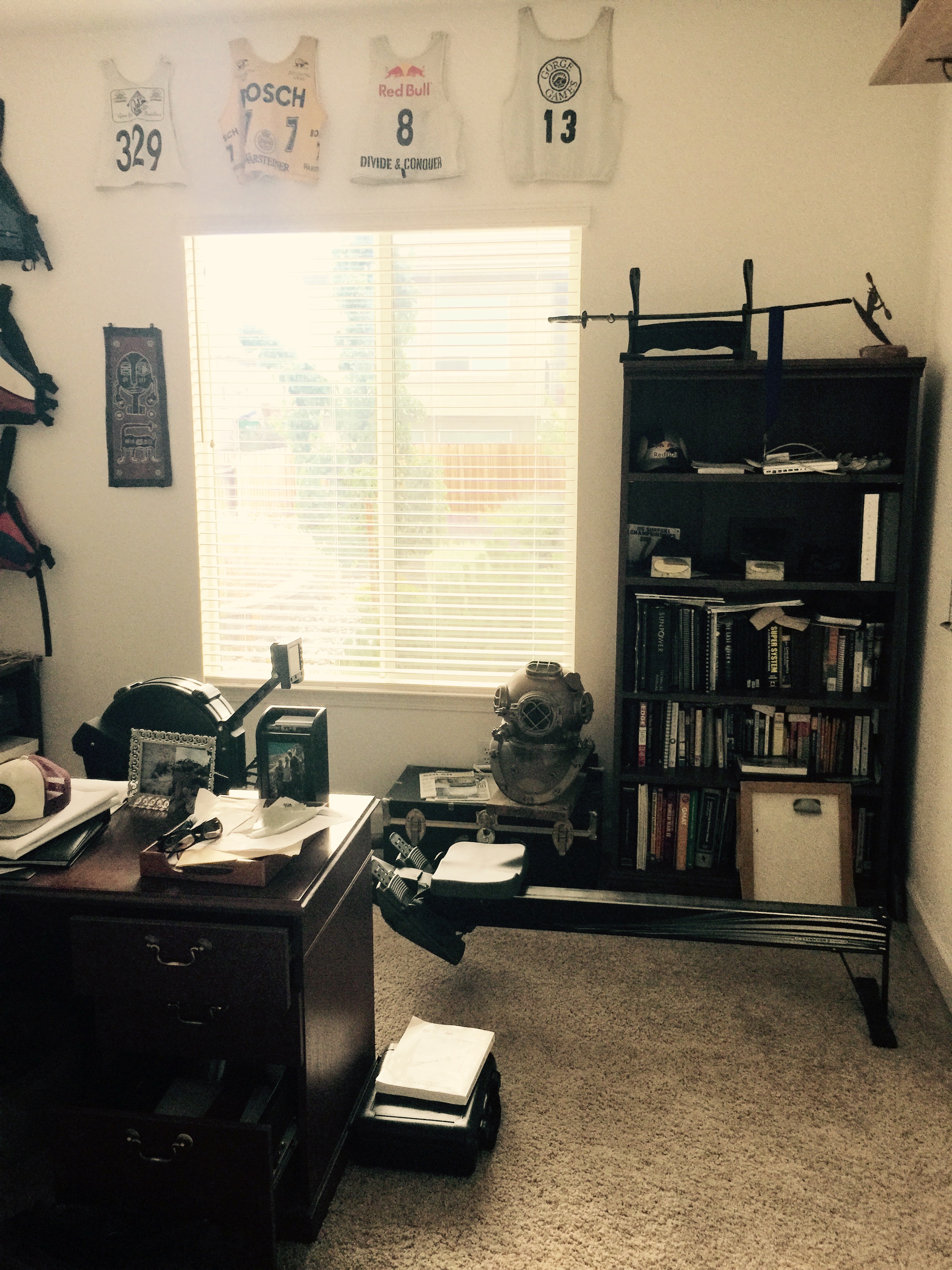
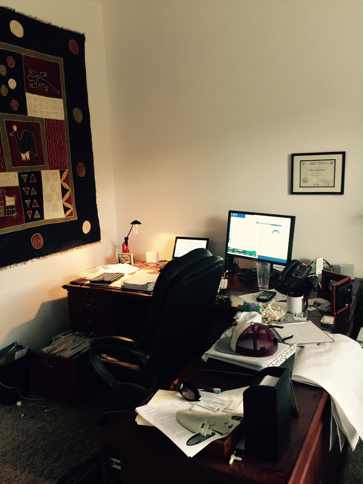
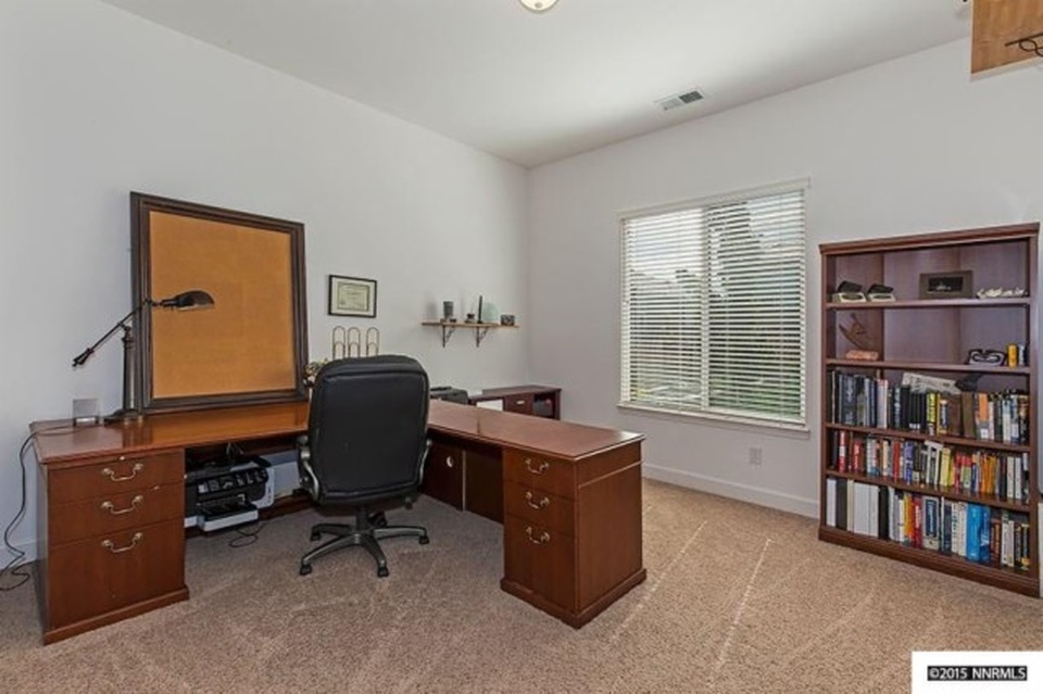
Home Office: These clients work from home so the office area was one of the heavily used areas and was full of personal momentos. One piece of advice I give to all of my staging clients is to de-personalize the space as much as possible. You want to appeal to the masses and allow them to visualize themselves in the space. As I mentioned earlier, these clients aced their homework list especially when it came to removing items from the office leaving it organized, roomy and ready to work!

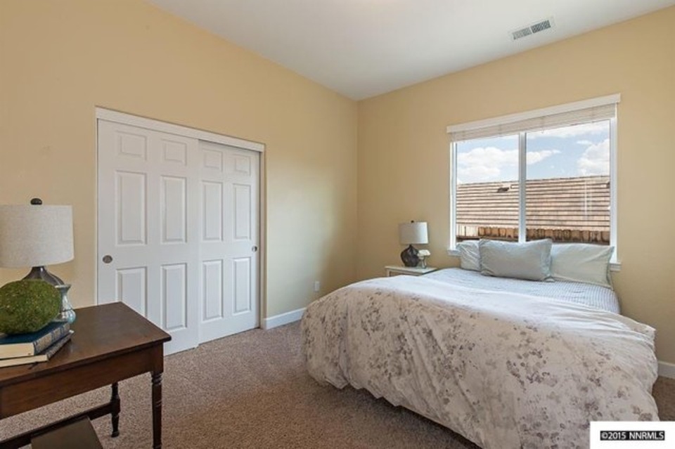
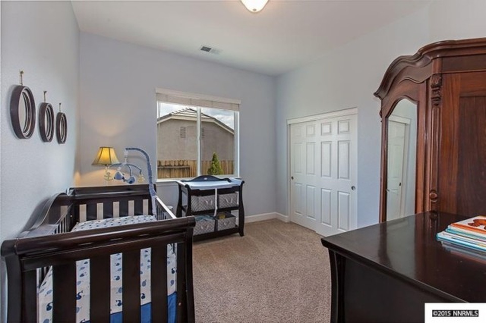
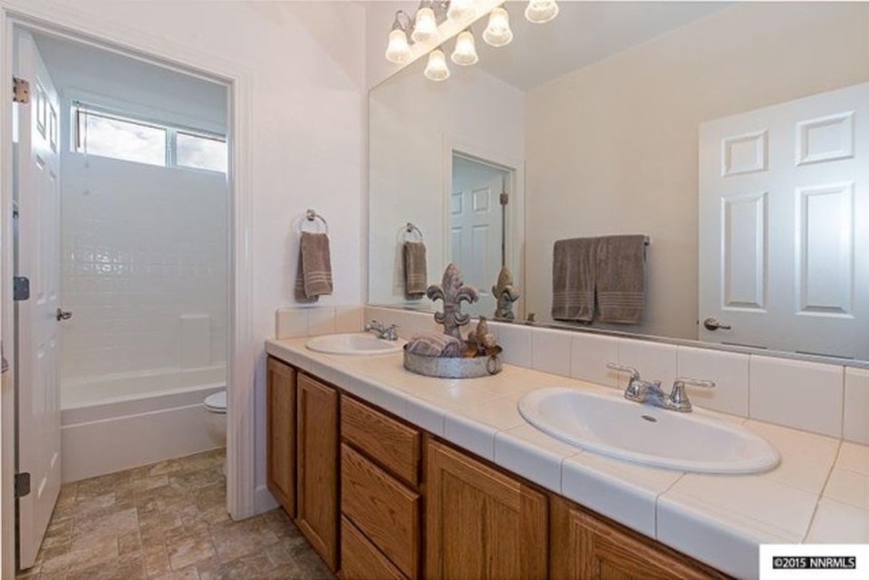
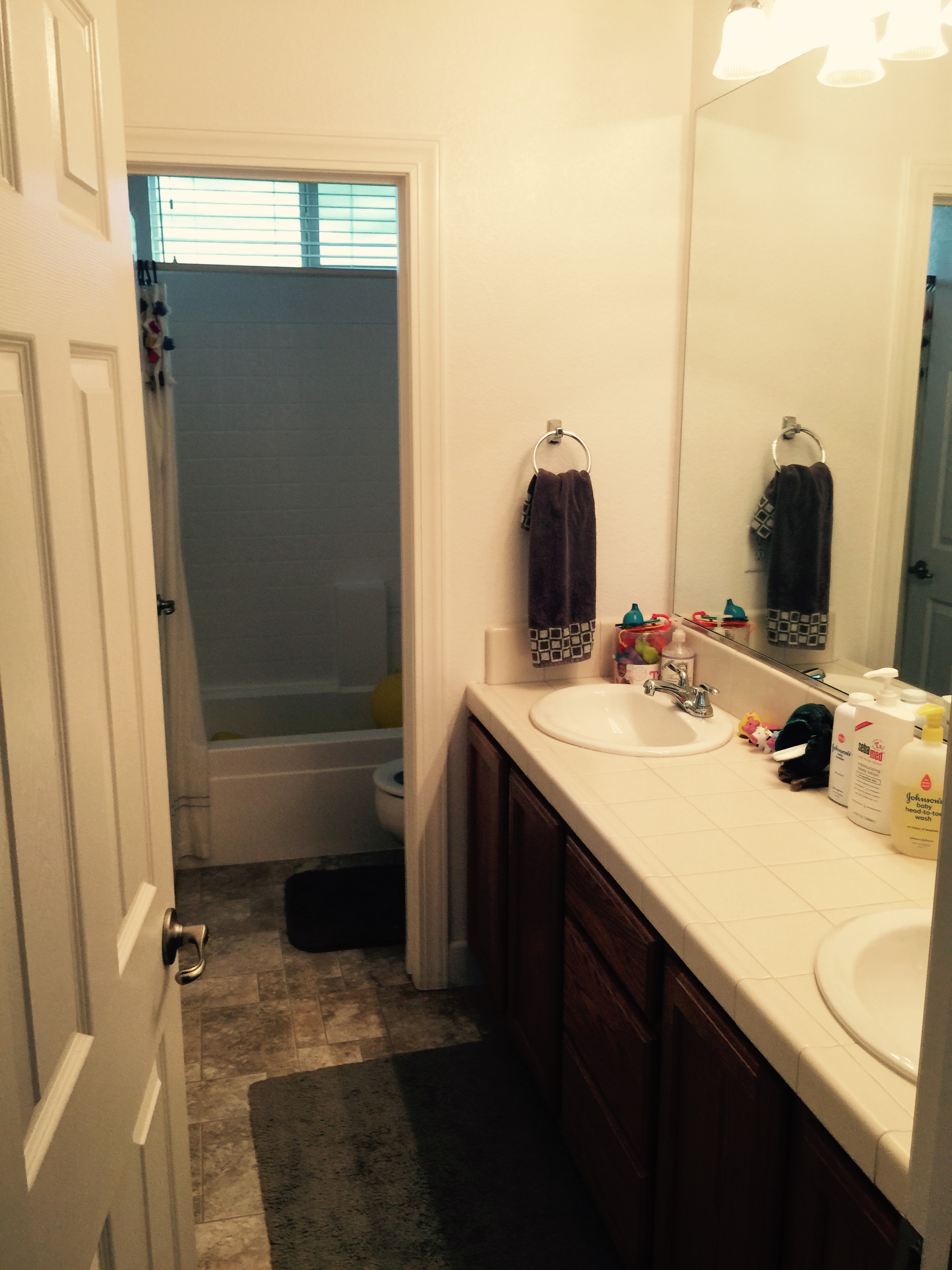
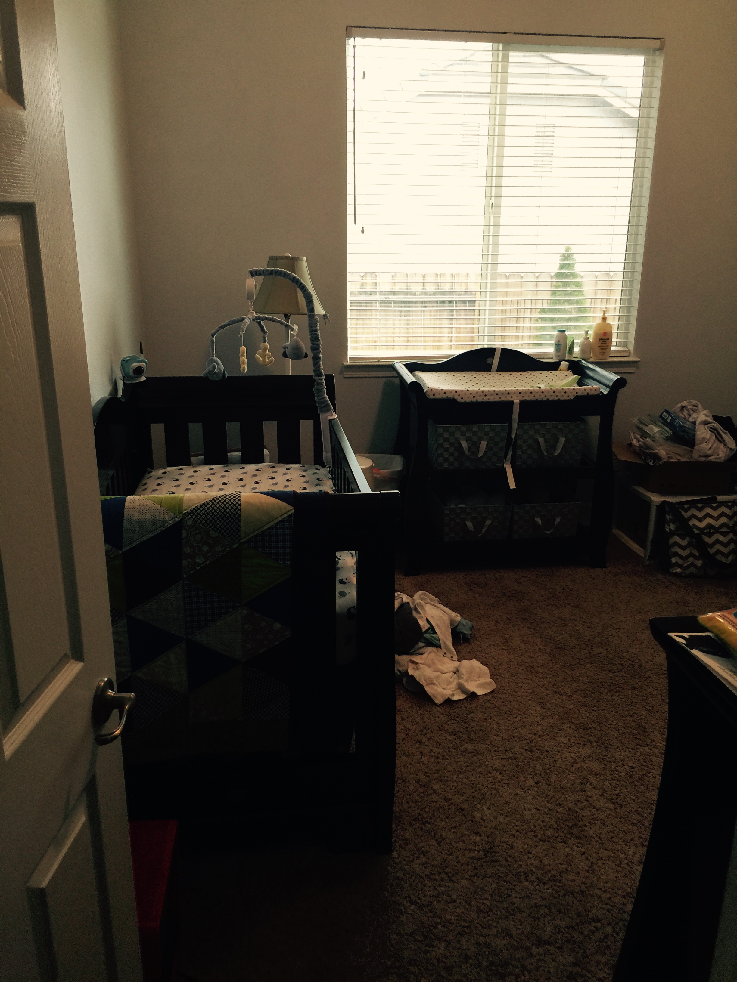
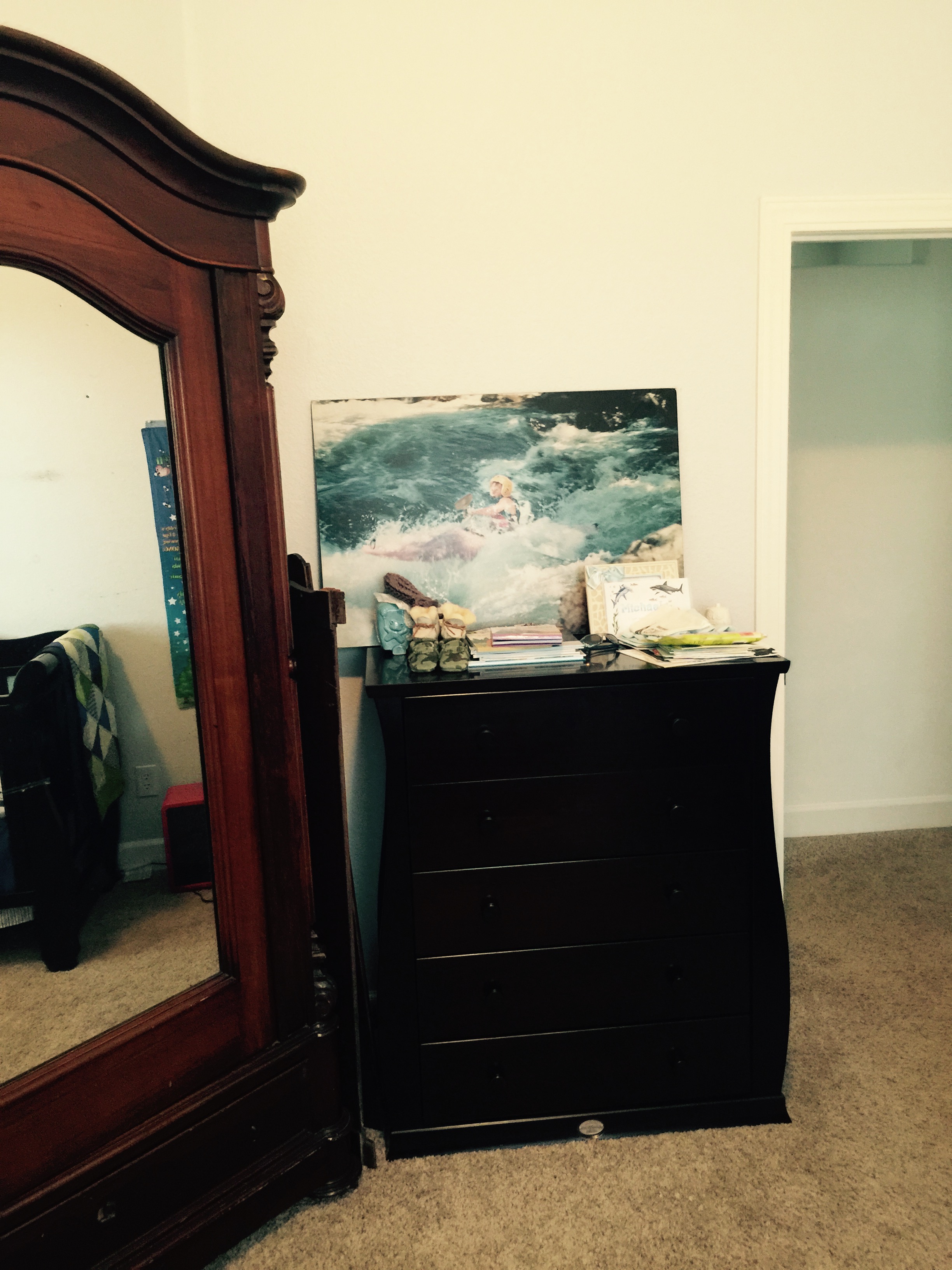
Spare Bedrooms and Guest Bath: These rooms needed a little fine tuning. We tagged some items for removal and re-positioned others. The result was better flow in the guest bedroom and a charming baby's room. 

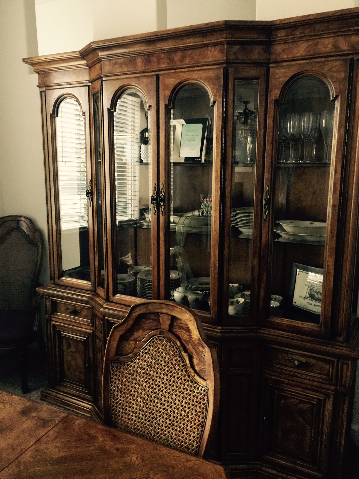
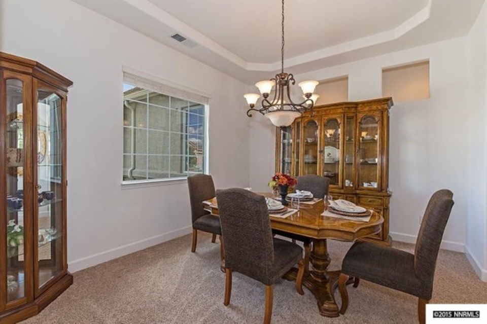
Formal Dining: Lastly, we used the existing furniture in the formal dining room with the exception of the original dining chairs. (I didn't get a very good before picture so I will leave you to imagine the rest). We brought in more modern Crate and Barrel dining chairs to modernize the original set. Then we set it for a dinner party and rearranged the items in the china cabinet. Small details can go a long way. If you have items that you feel are outdated in your home, making a simple change can completely alter the look. 

Final Tip: Remember all the pain is worth the gain. De-personalizing and de-cluttering may not be the most fun but they are essential to selling your home in the shortest amount of time for the highest amount of money. 

If you would like more details on this home, contact Chris Smith: csmithrealty@yahoo.com          775-843-0657 or if you would like to see it in person, there will be an open house this Sunday, July 26th from 11:00am-2:00pm

Property Details: 3259 Diamond Ridge Drive, Reno, NV 

3 bedrooms, 2.5 bathrooms, 2,440 sqft

You can see a virtual tour here: http://tours.in1spot-photography.com/public/vtour/display/377552